Knotty pine has a way of tugging at nostalgia. It reminds us of lakeside cabins, log walls polished by time, and summer cottages where light spills across honey-coloured wood.
Yet, while its amber tones feel timeless, decorating with knotty pine can be tricky. The warm wood grain can dominate a room if left without balance.
That’s where the right colour scheme comes in. Pairing knotty pine with thoughtful shades can turn a dated cabin into a cosy sanctuary, or a wood-heavy home into a modern rustic haven.
Here are ten colour schemes that bring out the best in knotty pine—softening, grounding, or elevating its character depending on the mood you want to create.
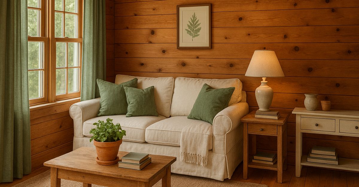
1. Sage green and cream
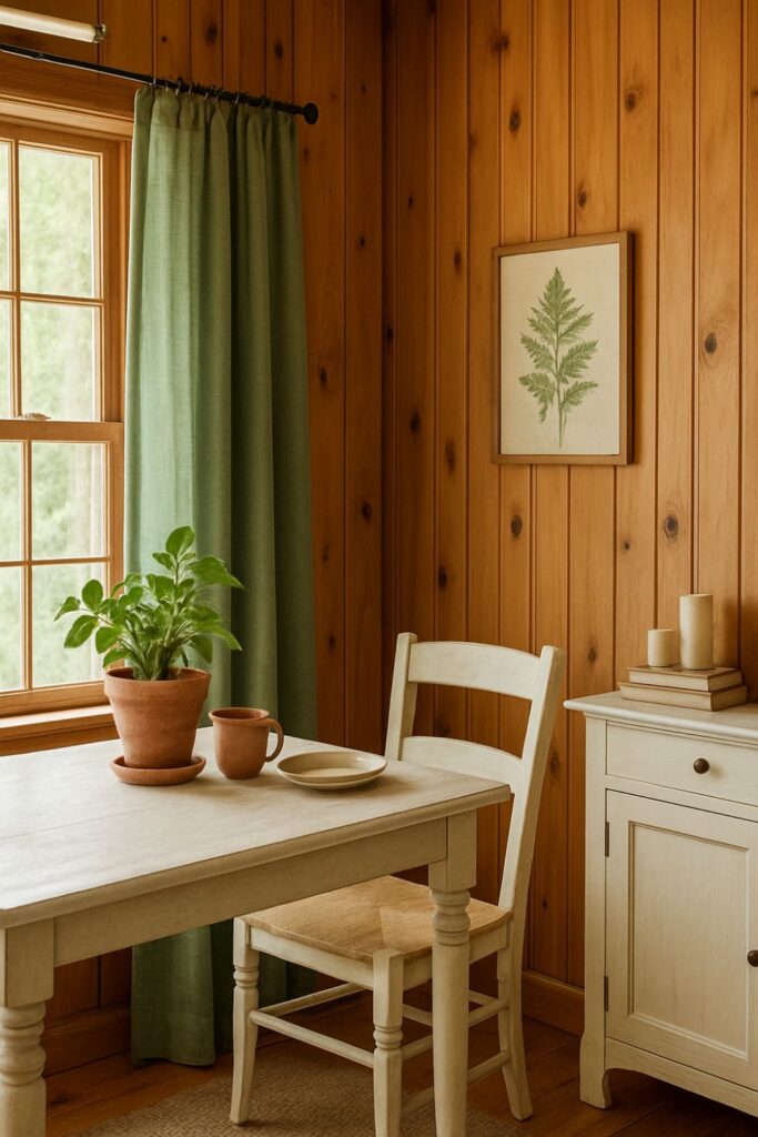
Soft sage green brings nature indoors, balancing knotty pine’s warm orange tones. Pair with creamy whites to keep the palette light and fresh.
Why it works:
Green sits opposite red on the colour wheel, so it naturally balances pine’s warmth. Cream prevents it from becoming too dark or heavy.
Styling tip:
Add sage linen curtains, a cream sofa, and botanical prints. A few terracotta pots tie in with the pine’s undertones.
2. Charcoal grey and linen white
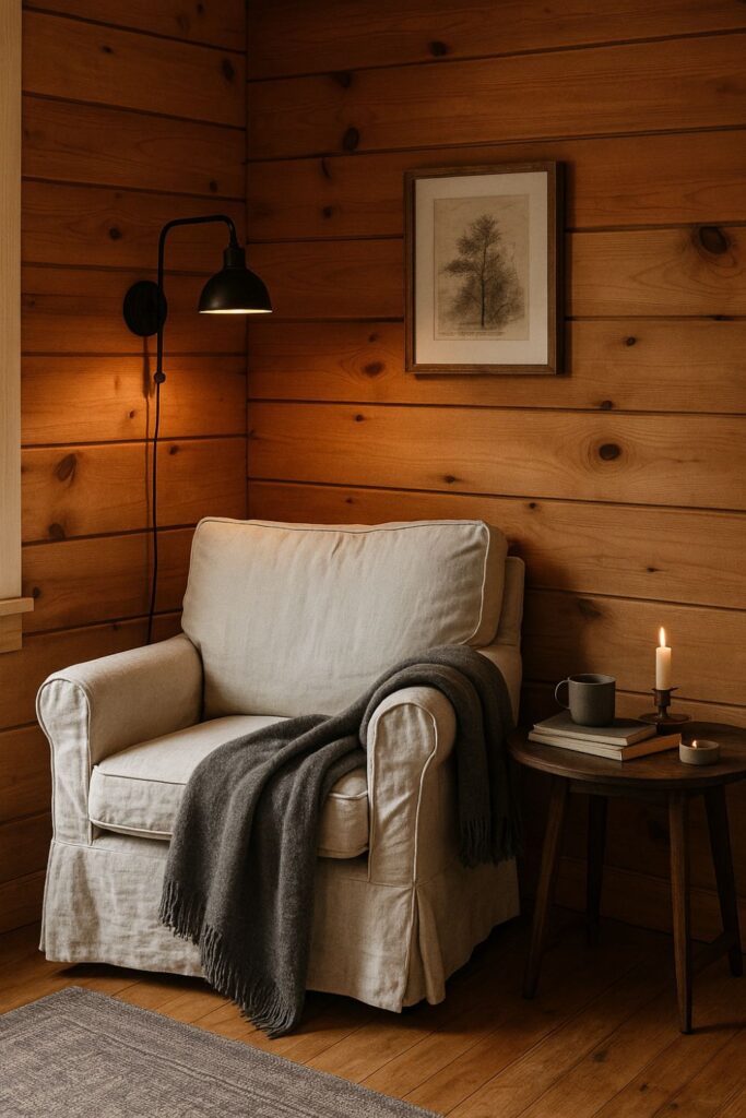
For a modern rustic edge, contrast pine’s warmth with charcoal. Add touches of linen white to soften the boldness.
Why it works:
The depth of charcoal anchors the brightness of pine, creating balance. White keeps it from feeling too heavy.
Styling tip:
Think grey wool throws, black iron fixtures, and a linen slipcovered armchair. Perfect for cabins that lean industrial-chic.
3. Dusty blue and pale stone
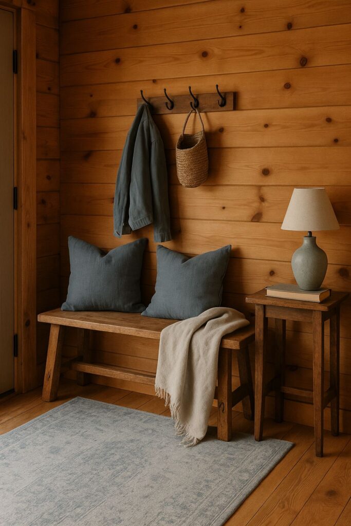
Blue cools down the warmth of knotty pine beautifully. Dusty, muted shades feel timeless, especially when paired with soft stone neutrals.
Why it works:
Blue and orange are complementary, creating harmony. A muted tone keeps it gentle rather than jarring.
Styling tip:
Try blue accent cushions, a stonewashed rug, and ceramic lamps in pale greys.
4. Olive green and warm beige
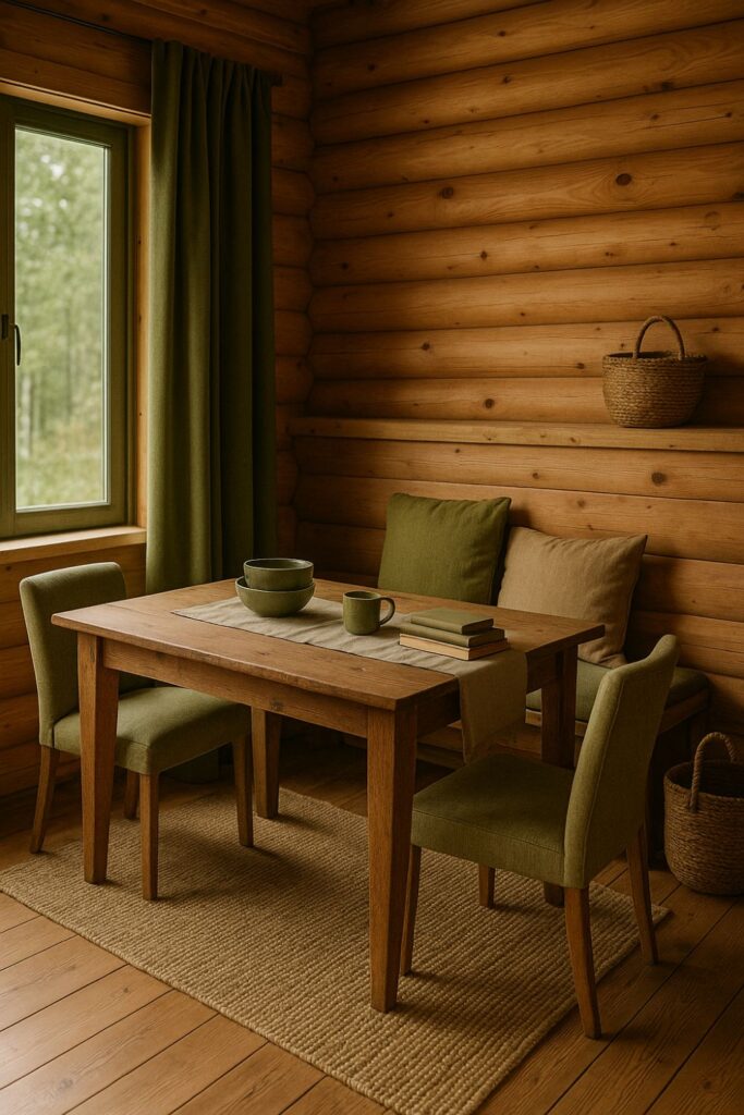
For a grounded, earthy look, olive brings depth while beige provides softness. This combination feels rooted in the forest.
Why it works:
Both shades echo natural surroundings. Olive enhances pine’s organic character, while beige mellows it.
Styling tip:
Olive velvet cushions, a jute rug, and warm beige textiles strike the balance. Add a few woven baskets for texture.
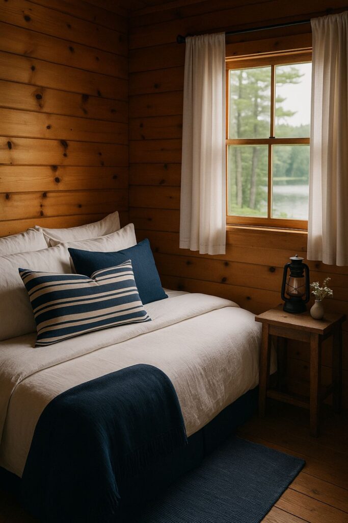
If you want your pine walls to feel nautical or New England-inspired, navy and white are a classic choice.
Why it works:
Navy adds drama without overpowering. White provides clarity and a fresh counterbalance to pine’s warmth.
Styling tip:
Incorporate navy throw blankets, striped cushions, and crisp white bedding. This works beautifully in lake cabins.
6. Terracotta and soft taupe
Terracotta complements knotty pine’s orange undertones, while taupe keeps the scheme from overwhelming.
Why it works:
Pairing similar warm shades creates a cohesive, sun-dappled effect. Taupe introduces calmness.
Styling tip:
Terracotta pottery, taupe linen curtains, and pine furniture blend seamlessly. Ideal for desert-inspired cabins.
7. Forest green and deep cream
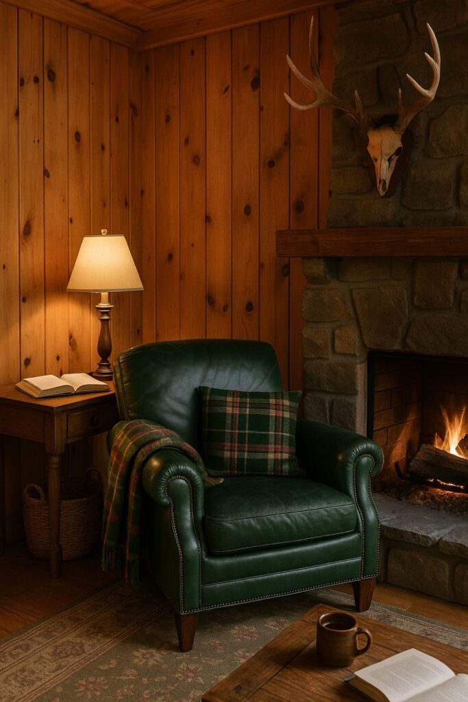
A darker green shifts pine interiors towards classic lodge style. Pair with a warm cream to lighten the effect.
Why it works:
The richness of forest green grounds pine’s brightness, while cream keeps it welcoming.
Styling tip:
Plaid throws, green leather armchairs, and cream lampshades create that timeless lodge feel.
8. Blush pink and ivory
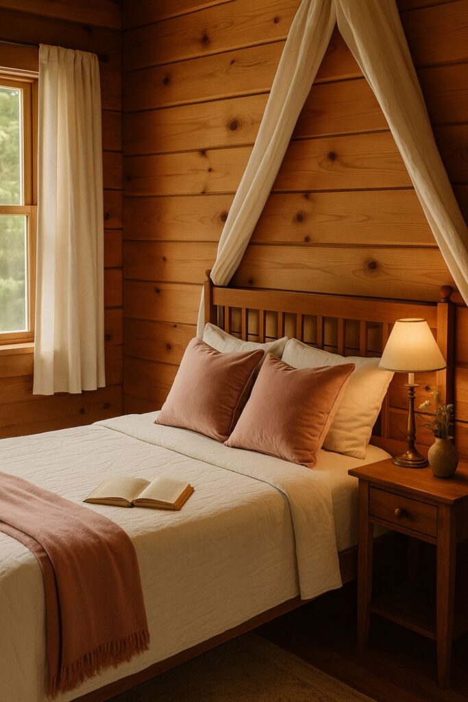
For something unexpected, pair knotty pine with blush. The warmth of pink harmonises, while ivory keeps it airy.
Why it works:
Blush echoes pine’s warmth without clashing. Ivory adds softness and balance.
Styling tip:
Blush velvet cushions, ivory curtains, and brass accents bring a subtle romantic touch.
9. Slate blue and driftwood grey
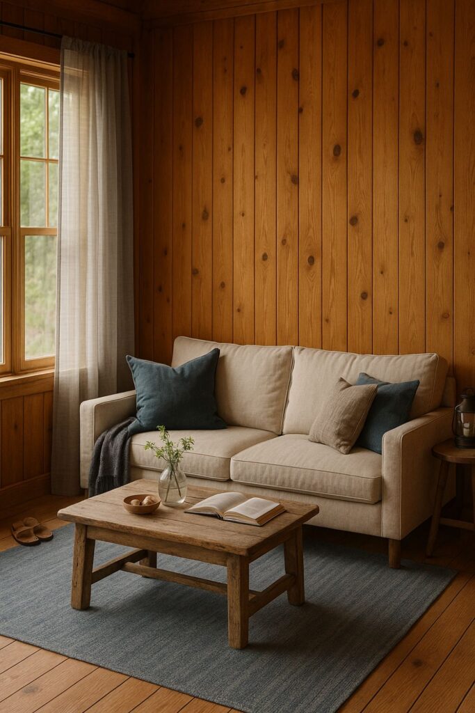
This combination creates a coastal cabin mood. The coolness of slate and driftwood tones plays beautifully against pine’s warmth.
Why it works:
Greys and blues help pine recede, creating a more relaxed, beachy aesthetic.
Styling tip:
A driftwood coffee table, slate blue rug, and sheer grey curtains create easy flow.
10. Mustard yellow and soft grey
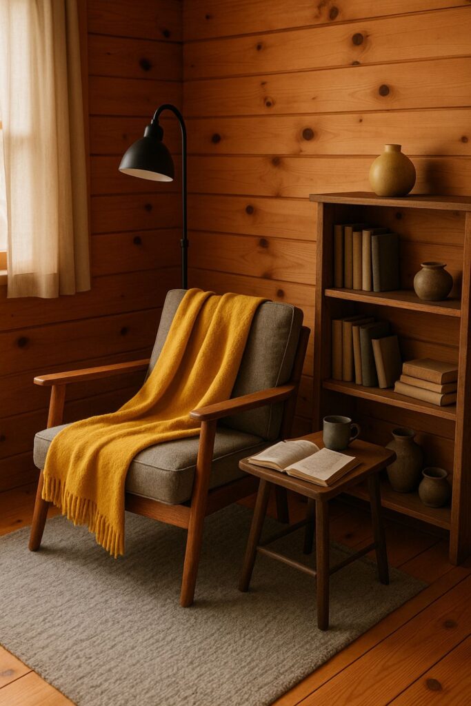
For a bold, cheerful look, mustard yellow pops against knotty pine. Pair with soft grey to ground it.
Why it works:
Yellow amplifies pine’s sunny warmth. Grey tones down the brightness, balancing the palette.
Styling tip:
Mustard throws, grey wool rugs, and rustic black metal fixtures create a cabin with personality.
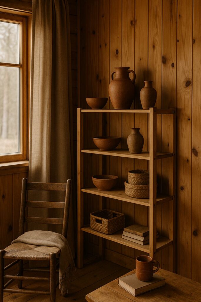
DIY project ideas for knotty pine colour schemes
- Painted trims: Try painting window trims or doors in one of your chosen accent colours to break up the wood.
- Textile layering: Cushions, rugs, and throws in your palette create instant impact without repainting walls.
- Accent walls: If you don’t want to cover your pine completely, paint just one feature wall in a complementary shade.
- Furniture finishes: Re-stain or paint furniture to match your chosen palette for a cohesive look.
- Art and decor: Introduce artwork that ties your colours together—botanical prints, landscape paintings, or abstract canvases.
Transitional decor: moving through the seasons
Knotty pine looks different as light changes through the year. Adjusting your palette with small swaps keeps it fresh:
- Spring: Add blush and sage accents for a gentle renewal.
- Summer: Bring in navy, white, and dusty blue for breezy freshness.
- Autumn: Terracotta, mustard, and olive deepen the palette.
- Winter: Forest green, charcoal, and creamy whites create a cocooning lodge feel.
Conclusion
Knotty pine is more than just wood panelling. With the right palette, it can be nostalgic yet modern, rustic yet refined. Whether you lean towards soft sage, bold navy, or earthy terracotta, your chosen colours will frame pine in a fresh way—helping it glow rather than overwhelm.
Let your palette tell the story you want: a forest lodge, a coastal retreat, or a romantic hideaway.
✨ Ready to style your knotty pine space? Follow along on Pinterest for moodboards and inspiration, or join my email list to get rustic colour guides and cabin dreambooks delivered straight to you.